티스토리 뷰
반응형
Flexbox Froggy
A game for learning CSS flexbox
flexboxfroggy.com
✏️ 1번

✏️ 2번

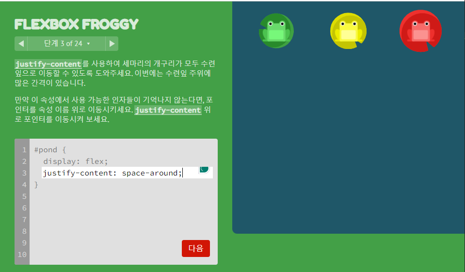
✏️ 3번
✏️ 4번

✏️ 5번

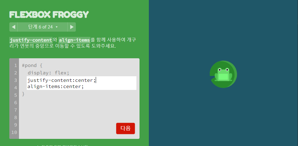
✏️ 6번
✏️ 7번

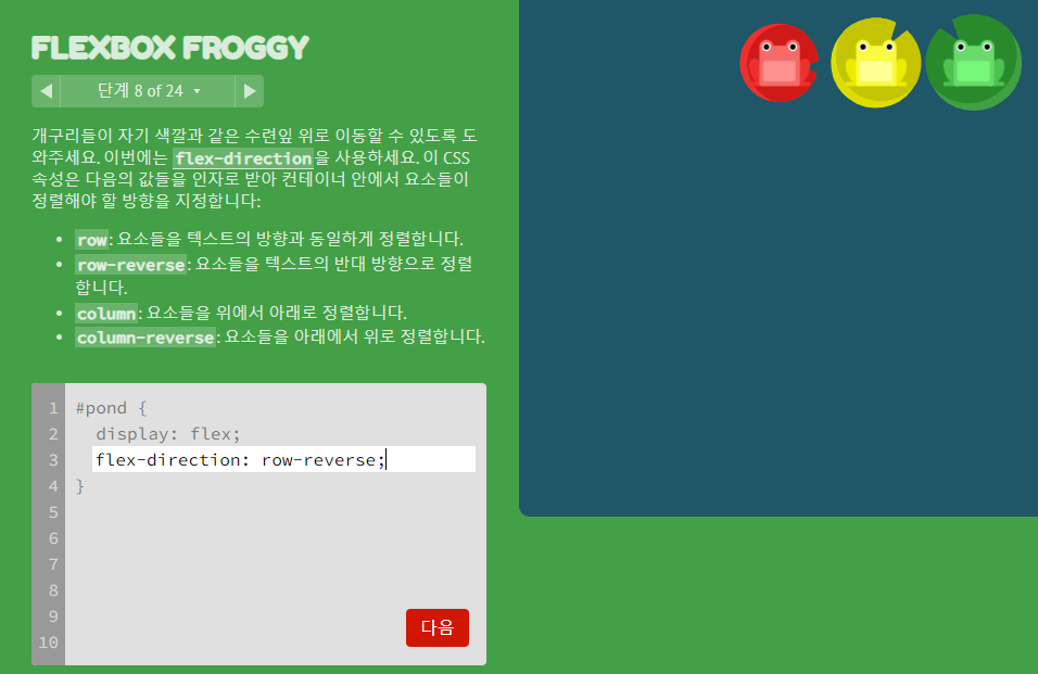
✏️ 8번
✏️ 9번

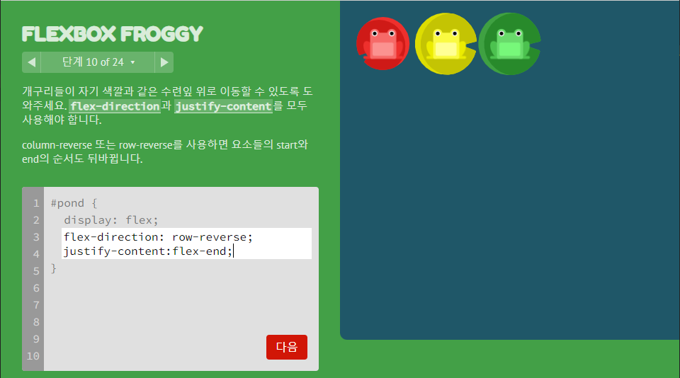
✏️ 10번
✏️ 11번

✏️ 12번

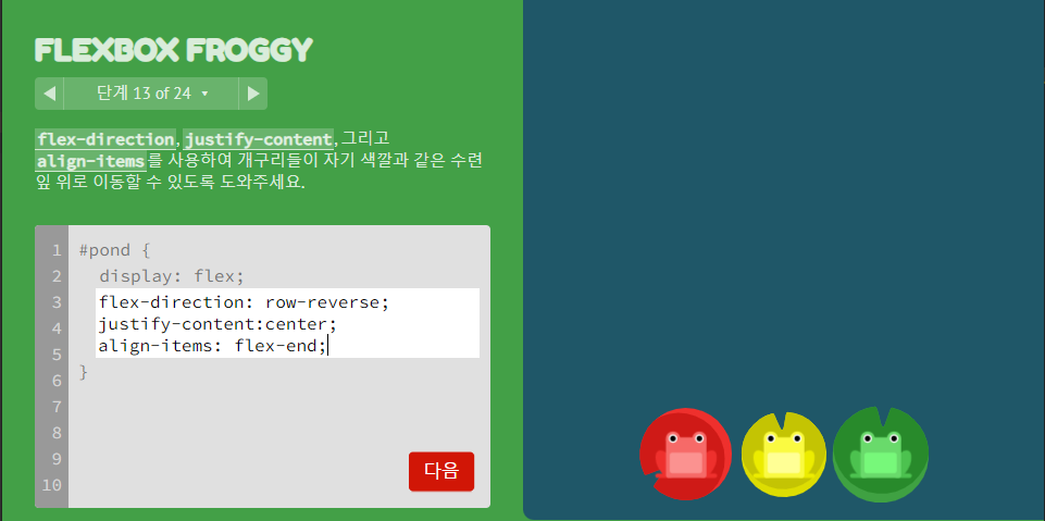
✏️ 13번
✏️ 14번

✏️ 15번

✏️ 16번

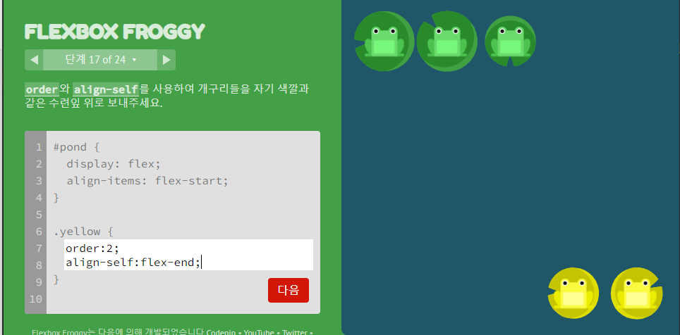
✏️ 17번
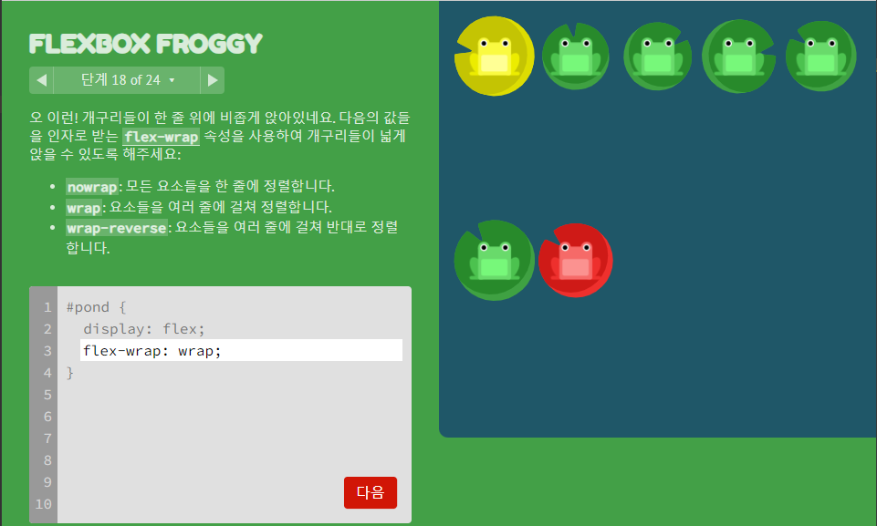
✏️ 18번
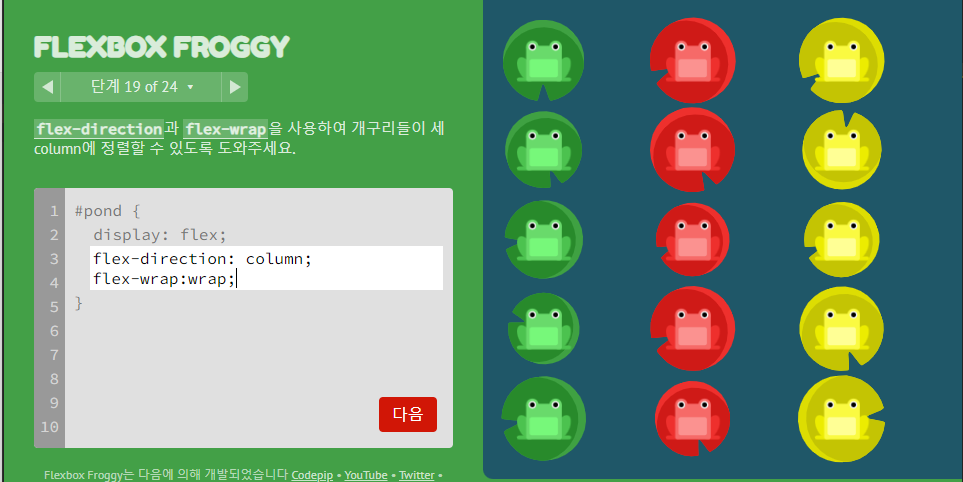
✏️ 19번
✏️ 20번

✏️ 21번

✏️ 22번

✏️ 23번

✏️ 24번

✏️ 정답 모음
<style>
1번
justify-content: flex-end;
2번
justify-content: center;
3번
justify-content: space-around;
4번
justify-content: space-between;
5번
align-items: flex-end;
6번
justify-content:center;
align-items:center;
7번
justify-content: space-around;
align-items: flex-end;
8번
flex-direction: row-reverse;
9번
flex-direction: column;
10번
flex-direction:row-reverse;
justify-content:flex-end;
11번
flex-direction: column;
justify-content: flex-end;
12번
flex-direction : column-reverse;
justify-content: space-between;
13번
flex-direction: row-reverse;
justify-content:center;
align-items: flex-end;
14번
order:1;
15번
order:-3;
16번
align-self: flex-end;
17번
order:2;
align-self:flex-end;
18번
flex-wrap: wrap;
19번
flex-direction: column;
flex-wrap:wrap;
20번
flex-flow: column wrap;
21번
align-content: flex-start;
22번
align-content: flex-end;
23번
flex-direction: column-reverse;
align-content: center;
24번
flex-direction: column-reverse;
flex-wrap:wrap-reverse;
justify-content:center;
align-content:space-between;
</style>
재밌으니까 다들 한 번씩 풀어보세요~
반응형
'Front-end > CSS' 카테고리의 다른 글
| [Web/CSS] CSS - 복습7 (0) | 2024.05.06 |
|---|---|
| [Web/CSS] CSS - CSS 그리드 레이아웃 (0) | 2024.05.06 |
| [Web/ CSS] CSS - 플렉스 박스 레이아웃 (0) | 2024.05.06 |
| [Web/CSS] CSS - 그리드 레이아웃 (0) | 2024.05.05 |
| [Web/CSS] CSS - 미디어 쿼리 (0) | 2024.05.05 |
반응형
공지사항
최근에 올라온 글
최근에 달린 댓글
- Total
- Today
- Yesterday
링크
TAG
- BFS
- HTML5
- 유클리드 호제법
- DFS
- 에라토스테네스의 체
- C++
- 스프링 부트 crud 게시판 구현
- c++ string
- C++ Stack
- 자바스크립트
- 투 포인터
- 이분 매칭
- 세그먼트 트리
- java
- 백준
- 카운팅 정렬
- 우선순위 큐
- 유니온 파인드
- 알고리즘
- Do it!
- 자바
- 백준 풀이
- js
- 자료구조
- DP
- 알고리즘 공부
- html
- 스택
- CSS
- 반복문
| 일 | 월 | 화 | 수 | 목 | 금 | 토 |
|---|---|---|---|---|---|---|
| 1 | 2 | 3 | 4 | |||
| 5 | 6 | 7 | 8 | 9 | 10 | 11 |
| 12 | 13 | 14 | 15 | 16 | 17 | 18 |
| 19 | 20 | 21 | 22 | 23 | 24 | 25 |
| 26 | 27 | 28 | 29 | 30 | 31 |
글 보관함